

Slide Designer
Concept & Strategy
Icons and Images
Copywriting
Presentation Designer
APPLICATIONS USED



To break down strategic concepts, slide 4 features a custom-built, segmented circular asset with an embedded wireframe globe, turning standard objectives into a striking visual anchor. Bold, elegant typography takes center stage in 5 and 6, which transitions into an advanced panel layout in 7.




The final presentation achieved incredible acclaim from key stakeholders and internal staff, who highly valued its visual continuity, sharp layout hierarchy, and polished design. Because of its outstanding aesthetic quality, the deck was chosen to be presented at a Zeta internal townhall event.

PRESENTATION DECK
The design process for the Zeta Global deck focused on establishing a sophisticated, cohesive visual identity through custom-designed brand assets and meticulous structural layouts. Crucially, due to non-disclosure agreements (NDAs), all sensitive company data and strategic verbiage have been removed and replaced with standard lorem ipsum placeholders and generic descriptions. This deck is showcased strictly to demonstrate high-level spatial design, asset creation, and corporate branding capabilities.


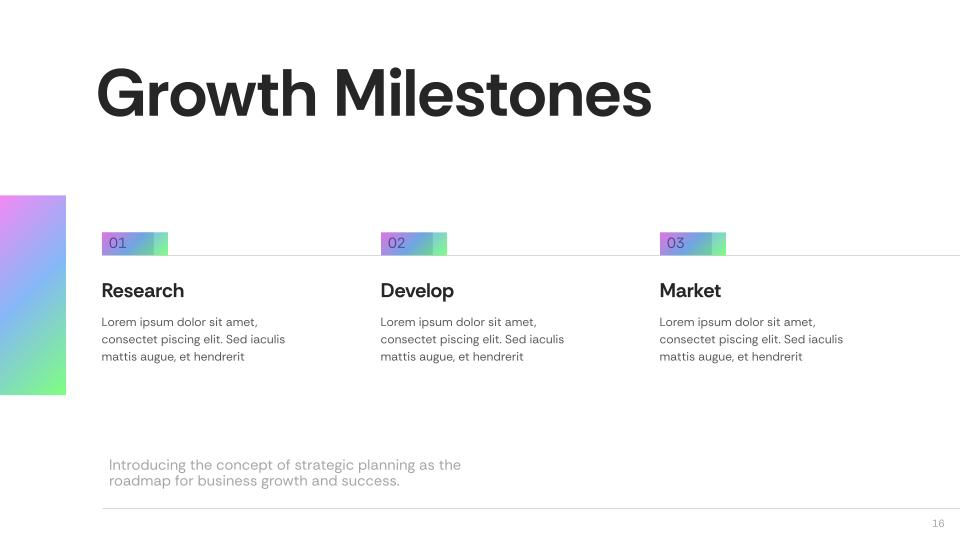
Slides 12–18 establish a high-contrast corporate aesthetic that balances human elements, minimalist data structures, and vibrant geometric accents.
The corporate Zeta logo is integrated with modern geometric gradient frames and a stylized, diagonal photo mask that immediately sets a professional, high-tech tone. This premium aesthetic carries consistently throughout the deck: it introduces a vibrant teal-to-magenta gradient bar overlaying a high-contrast black-and-white image of the team.
Slide 8 pairs a clean section divider with numerical data layouts, while Slides 9 and 10 utilize high-contrast, dark-mode text cards accented by neon gradient blocks to ensure maximum readability.
Slides 18–21 bridge clean, data-driven reporting with bold section transitions and highly customized infographic visuals.
Slides 21 to 25 seamlessly transition from highly styled, data-heavy infographics to a clean corporate directory, culminating in a striking asymmetric concluding slide.

Work


